Wednesday, 18 June 2014

vsdhfbvldfhvb


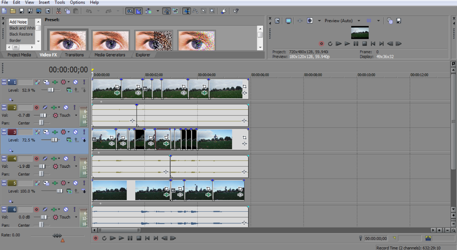
The beginning of all the clips. I only had a vague idea of what idea I was pursuing with this one but I just started with some 720p footage at 60fps and started playing around with it on Sony Vegas. I threw a track over the top and decided to manipulate the video to move with the melody.

The next two clips I did more of the same thing. I edited some footage to move with a basic melody.

I considered making separate clips each with a single melody to be played to together to create a more intricate piece.

However I decided to put three layers together but despite a consistent background, the layers were a bit too ghostly so I blackened the sky for the sake of the movement. 
The low range melody is me on the video
The middle range melody is the other person up close
And the highest melody is person in the distance

The Sony Vegas Interface for some of the videos.


This is a video of a stop animation I initially attempted last year. I did the initial video on i movie , it was rough and didn't flow well. This is a small sample of it re attempted in this class I would have like to have developed it further.

Tuesday, 17 June 2014

gif for sculpture class

this was initially a gif of a number of different positions of a maquette for sculpture class. Its looped three times with sound. The third time Ive made the sound of gargling and spitting it out in effort to reference the third panal "musicians hell." This is because I didn't create an audio I was happy with and hearing three times im a row was annoying.

Video 3 - eye, words

For my last video, I have mixed elements from the first two videos.
I have taken the use of text from the first video and the distortion and lack of information of the second. In this video, I have takes paper and poked holes to form the phrase "What do you see?"

I chose this phrase to continue the idea of loss of meaning, disconnect and communication but to a more personal level. As a person studying art and wishing to pursue a career in art, it is common to have experience a struggle for mutual understanding or a desired interpretation between myself and an audience through the work I produce.

In this video, I have projected onto paper that i had stuck onto an easel with tape. The phrase was 'written' in holes that i had poked through with a thumbtack. I used the same projection of the eye (as people would obviously look at my work) which then not only projected onto the paper, but through to the wall behind. Not only was there a distortion in the image of the eye on the wall, but there was a lack of information with the text, as due to the movement in the animation, the text was not always clear and required focus to be clearly read.

The concept was that there was a disconnect between where i would be standing if i was creating an artwork and the wall, where the artwork would be shown and people would view it. It shows how perspective change between people and how there is not always the same meaning made. Others can understand bits and pieces of the main idea but will not completely experience something in the exact, and thus a disconnect and loss of meaning.


Video 2 - Tea Pot distorion

In this video, i have distorted a simple animation of an eye i created on photoshop. This was a quick experiment i did to see how the projection would react to glass and reflection. I quite like the ghostly effect of the video. However, it was too difficult to maintain as it required someone move the glass teapot used to distort the eye (not the ideal audience participation).

The distortion and loss of information was interesting and still successful in my opinion.

video at https://www.youtube.com/watch?v=rRmtqMC2Hfc&feature=youtu.be

Video 1 - Balloons

The first video is one where i have made a simple animation with text on powerpoint, which i then screen recorded on my laptop and projected onto balloons to distort them.

I used the phrase "What's the point?" as the basis of my idea for media class focused on the disconnect between people and the loss of meaning between communication. The balloon projection focused on the confusion and distortion of meaning between communicator and audience.

The phrase chosen was a question i had asked myself multiple times during the process of creating the work. This question was significant because the purpose or meaning of something can be easily misinterpreted and can alter how others react, therefore can easily cause loss of meaning, miscommunication and disconnection.

final


I could not upload my video, should too big or somthing wrong, however i show on presentation tomorrow, and just write some a small thing to talk about my video


In the video 1, i am using the photoshop to do a timeline, in the first, i am doing normal play and forword, let video keep moving. and i make it 0.3 second per each photo, make it a bit slow and look more clear.
 
 
In the video2, also used photoshop to do a timeline, and this video gonna do like a forword the balloon in motion, but i was used 3 same layers, the first opacity i was put 100% ,second 70% and the third 50%, cover it each photo. it will can see not clear and look more fun in the motion.
 
 
In the video3, same photoshop timeline, it is normal play not forword motion, but different opacity for every each photo, from 100% to 50%, not more clear the motion moment.
 
In the video4, same photoshop timeline, the different is pierce in burket, and it is moving fast, not any slow second, 0.00 second, it feel more stimulate. all 100% opacity.
 
 
In the video 5, same photoshop timeline, but this put 6 layering in the video, every each opacity in the photo, and i put around 60 photo in this video to cover the layering. and 0.03 second in each photo. and this is a forward photo. opacity from 40% to 100%.
 

Developing the final outcomes

I finally managed to get around to using my stereo-camera (a "tiny tim" holga) to produce some unique stereo-gifs. I wanted to push my ideas further by looking into using double exposure methods to create a unique 3D effect. I am happy with the results of the photos that worked well for the 3D effect but I would have loved to get more images with the girls. The film gifs have a totally different aesthetic from the digital shot gifs, but I am really torn between the two as to what I prefer.


Monday, 16 June 2014

experimenting


In the bath images I was exploring different angles of the same subject in an effort to produce an image with intersecting planes and angles. I think this approach produces an unsettling image and helped me explore further the idea of the space within a frame.
I like the intensity of one frame you can achieve on Photoshop by layering similar images or different photos of the same subject on top of one another adjusting the brightness and contrast. Limited colours, simple content and large amount of layering could have the potential to create a lot of depth in a simple image.

The images involving white goods are a combination of Margaret river water waste management and photos of the white goods at the tip. I was playing with the idea of placing domestic objects in the context of an environment they create.

I enjoy the possibilities Photoshop has in creating fantasy spaces, through layering and realistic affects such as shadow. I experimented with shadow in the black and white image.


In these images I was playing around with frames. Using photoshop has made me conscious of frames in trying to understand the process of layering and timelines.
I like the idea of exploring the space within a frame as if it were a 3d. I think some of my confusion in my attempt to get an understanding of Photoshop can be seen in some of these images.

3


In these images I was attempting to limit myself to three, in the form of colour object or layers. I found this helpful in producing balance in my image and in exploring the layering possibilities of photoshop.

Finals

After Printing the final images onto a textured, earthy hand made paper I began processing them in photoshop, fixing layers and adjusting colours as well as adding colour with paint.


Texture

Finishing off my pieces, here are some scans of the texture I have incorporated into the final products.


Finishings

In the last couple weeks i have been working heavily on creating some different series. They don't have names but in my head they are called yellow, blue and green.


I can't really stop making them - digital collage carries the curse of variation