Monday, 31 March 2014

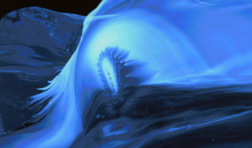
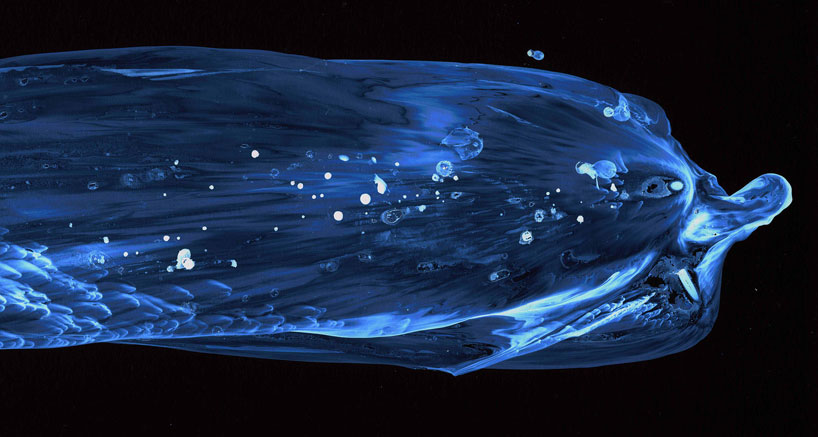
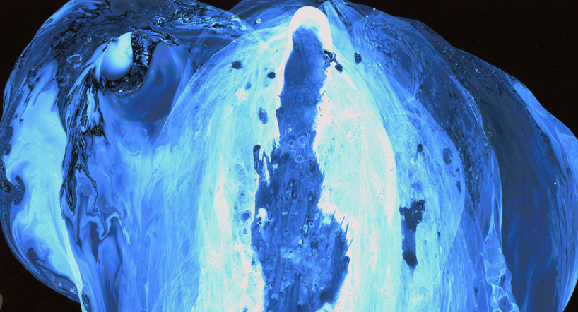
Photos of Paint on Popped Balloons by Fabian Oefner


Liquid Jewel is a new project by Swiss photographer Fabian Oefner (previously) as part of his ongoing exploration of manipulating paint with natural forces such as sound, centrifugal force, and even magnetism. In these new images the photographer turned his attention toward air pressure by harnessing the power of the popped balloon. Oefner covered modeling balloons in thick layers of acrylic paint and photographed each one milliseconds after popping it with a needle. The resulting effect captures the paint as its driven simultaneously inward and outward. See more over on Behance.Liquid Jewels: High Speed Photos of Paint on Popped Balloons by Fabian Oefner  paint high speed color Liquid Jewels: High Speed Photos of Paint on Popped Balloons by Fabian Oefner  paint high speed color Liquid Jewels: High Speed Photos of Paint on Popped Balloons by Fabian Oefner  paint high speed color Liquid Jewels: High Speed Photos of Paint on Popped Balloons by Fabian Oefner  paint high speed color Liquid Jewels: High Speed Photos of Paint on Popped Balloons by Fabian Oefner  paint high speed color ehance.

Friday, 28 March 2014

Materiality Project


http://www.aqnb.com/2012/09/19/the-materiality-of-paint-show-review/

Installation of Ian Davenport’s work in The Materiality of Paint at Fine Art Society Contemporary. Image courtesy of FAS London.

Materiality in architecture is the concept of, or applied use of, various materials or substances in the medium of building.
Material is a relative term in architectural design and so may be used to designate materials which are considered to be virtual, (such as photographs, images or text) or other materials which are natural. Some materials may be considered as combinations of the two. Certain veneers which are composed of images printed on plastic are a good example of this. Observationally therefore, virtual materials can be said not to exist without a natural physical substrate. Therefore, what separates a virtual material from a natural one is some aspect of the mind and perception as well as a process of representation to produce them.

http://en.wikipedia.org/wiki/Materiality_%28architecture%29


When referring to digital text, pictures and documents, the term materiality refers to the physical medium used to store and convey the text, as apart from the text itself. This concept is important to archivists and historians, who often require access to the physical medium of documents or correspondence in order to understand the transitions that the document underwent between initial conception and final publication.[1]

http://en.wikipedia.org/wiki/Materiality_%28digital_text%29 


In terms of Digital Media  Materiality can be defined in many ways,

'Considerations of materiality can be universally applied in the aesthetic
assessment of diverse contemporary art forms that range from traditional, low-tech
media to conceptual, ephemeral works. 
Examples here include works by Richard Tuttle, Eva Hesse, Marina Abramovic, Tara Donovan, Agnes Martin, Cecily Brown, Tony Fitzpatrick and Bill Viola'.
 
Materiality as the Basis for the Aesthetic Experience In Contemporary Art By Christina Mills
 
 http://www.umt.edu/art/sites/default/files/documents/graduate/Mills_Christina%20MA%20Art%20History.pdf 


In a parallel course, the artistic object strays out of museums, art spaces and high-class collections in order to become a desktop image, a saved file, data flowing on the Internet; every user can get it and transform it.
Art becomes more accessible than ever, especially if we consider the fact that many artworks are created in the computer and are designated to stay there, without ever escaping this immaterial digital world. Works that never reach materiality; they are transferred through the Internet, meet the public and change shape as they interact with it. In other words, every work of art -whether it has material substance or not- has somehow become a common and everyday thing.
Everyday life losing its materiality: Dematerialized objects, simulated experience and virtual identities
On the other hand, although we can have access to these digital data any moment we wish, they always escape our senses. A computer translates any kind of information into numerical data, saves it and subsequently reconstructs it in an understandable form that reproduces the familiar form of a photo, a video or a printed text.
However, a digital photograph -or a digital video- is very different from an analogical one: it’s not the registration of light onto film, but a synthesis of elements called “pixels”; the pixels correspond to numerical values according to their color and their place in the picture.
In other words, what we have is not a copy or a registration of reality, but a reconstruction of what’s visible:
“A digital image does not represent an optical trace such as a photograph but provides a logical model of visual experience. Its structure is one of language: logical procedures of algorithms through which data is orchestrated into visual form”[1].
- See more at: http://interartive.org/2009/06/hypertext-digital-art/#sthash.pNDKnSkN.dpuf

Beyond Materiality: A digital revolution in life, art and logos | CHRISTINA GRAMMATIKOPOULOU

ελληνικά

Our lives behind a radiant screen: photos, books, music… things that used to color up our personal space, resonating moments of the past and reflecting personality and taste, are now crammed onto the infinitesimal square millimeters of the hard disk. They can be multiplied intact, change place with one click, get converted through software or be forever erased without leaving a trace; the noise of the dust on the grooves of the vinyl disk, the smell of a new book, the yellowish paper of the old photographs, are experience more and more distant in this world of minimal matter.
In a parallel course, the artistic object strays out of museums, art spaces and high-class collections in order to become a desktop image, a saved file, data flowing on the Internet; every user can get it and transform it.
Art becomes more accessible than ever, especially if we consider the fact that many artworks are created in the computer and are designated to stay there, without ever escaping this immaterial digital world. Works that never reach materiality; they are transferred through the Internet, meet the public and change shape as they interact with it. In other words, every work of art -whether it has material substance or not- has somehow become a common and everyday thing.
Everyday life losing its materiality: Dematerialized objects, simulated experience and virtual identities
On the other hand, although we can have access to these digital data any moment we wish, they always escape our senses. A computer translates any kind of information into numerical data, saves it and subsequently reconstructs it in an understandable form that reproduces the familiar form of a photo, a video or a printed text.
However, a digital photograph -or a digital video- is very different from an analogical one: it’s not the registration of light onto film, but a synthesis of elements called “pixels”; the pixels correspond to numerical values according to their color and their place in the picture.
In other words, what we have is not a copy or a registration of reality, but a reconstruction of what’s visible:
“A digital image does not represent an optical trace such as a photograph but provides a logical model of visual experience. Its structure is one of language: logical procedures of algorithms through which data is orchestrated into visual form”[1].
- See more at: http://interartive.org/2009/06/hypertext-digital-art/#sthash.pNDKnSkN.dpuf
 In a parallel course, the artistic object strays out of museums, art spaces and high-class collections in order to become a desktop image, a saved file, data flowing on the Internet; every user can get it and transform it.

Art becomes more accessible than ever, especially if we consider the fact that many artworks are created in the computer and are designated to stay there, without ever escaping this immaterial digital world. Works that never reach materiality; they are transferred through the Internet, meet the public and change shape as they interact with it. In other words, every work of art -whether it has material substance or not- has somehow become a common and everyday thing.


Everyday life losing its materiality: Dematerialized objects, simulated experience and virtual identities


On the other hand, although we can have access to these digital data any moment we wish, they always escape our senses. A computer translates any kind of information into numerical data, saves it and subsequently reconstructs it in an understandable form that reproduces the familiar form of a photo, a video or a printed text.


However, a digital photograph -or a digital video- is very different from an analogical one: it’s not the registration of light onto film, but a synthesis of elements called “pixels”; the pixels correspond to numerical values according to their color and their place in the picture.


In other words, what we have is not a copy or a registration of reality, but a reconstruction of what’s visible:
“A digital image does not represent an optical trace such as a photograph but provides a logical model of visual experience. Its structure is one of language: logical procedures of algorithms through which data is orchestrated into visual form”[1].

Beyond Materiality: A digital revolution in life, art and logos | CHRISTINA GRAMMATIKOPOULOU

ελληνικά

Our lives behind a radiant screen: photos, books, music… things that used to color up our personal space, resonating moments of the past and reflecting personality and taste, are now crammed onto the infinitesimal square millimeters of the hard disk. They can be multiplied intact, change place with one click, get converted through software or be forever erased without leaving a trace; the noise of the dust on the grooves of the vinyl disk, the smell of a new book, the yellowish paper of the old photographs, are experience more and more distant in this world of minimal matter.
In a parallel course, the artistic object strays out of museums, art spaces and high-class collections in order to become a desktop image, a saved file, data flowing on the Internet; every user can get it and transform it.
Art becomes more accessible than ever, especially if we consider the fact that many artworks are created in the computer and are designated to stay there, without ever escaping this immaterial digital world. Works that never reach materiality; they are transferred through the Internet, meet the public and change shape as they interact with it. In other words, every work of art -whether it has material substance or not- has somehow become a common and everyday thing.
Everyday life losing its materiality: Dematerialized objects, simulated experience and virtual identities
On the other hand, although we can have access to these digital data any moment we wish, they always escape our senses. A computer translates any kind of information into numerical data, saves it and subsequently reconstructs it in an understandable form that reproduces the familiar form of a photo, a video or a printed text.
However, a digital photograph -or a digital video- is very different from an analogical one: it’s not the registration of light onto film, but a synthesis of elements called “pixels”; the pixels correspond to numerical values according to their color and their place in the picture.
In other words, what we have is not a copy or a registration of reality, but a reconstruction of what’s visible:
“A digital image does not represent an optical trace such as a photograph but provides a logical model of visual experience. Its structure is one of language: logical procedures of algorithms through which data is orchestrated into visual form”[1].
- See more at: http://interartive.org/2009/06/hypertext-digital-art/#sthash.pNDKnSkN.dpuf

http://interartive.org/2009/06/hypertext-digital-art/ 


Wednesday, 26 March 2014


His gaze has been so worn by the procession
Of bars that it no longer makes a bond.
Around, a thousand bars seem to be flashing,
And in their flashing show no world beyond.

The lissome steps which round out and re-enter
That tightest circuit of their turning drill
Are like a dance of strength about a center
Wherein there stands benumbed a mighty will.

Only from time to time the pupil’s shutter
Will draw apart — an image enters then,
To travel through the tautened body’s utter
Stillness — and in the heart end.

translation by Robert Bly (original poem in German called Der Panther by Rainer Rilke)
center, bars, cycles and motion gained from sequence of still images are a few of the elements I will focus on in composition. This is a Muybridge image of "cat trotting".


a translation by Robert Bly
I started out with a few Stan Brakhage clips, Murder Psalm and Mothlight, and liked the elements of natural v. constructed brought out by the contrast between filmed work and more traditional media used on the film.


The way it contrasted more traditional forms of art with the at the time new media of filmed video appealed to me. I wanted to work it in with my own interests and hobbies, which is both digital and traditional illustrations/painting.
I intend to both “update” and personalise Brakhage’s work whilst remaining a kind of homage to the emotive/aesthetic qualities of the film, I am leaning toward creating small animations or gifs, combining both the digital and traditional paintings of the same image to create movement in a static piece.

I also intend to examine the qualities of the original traditional work (chosen from my previous works in order to maintain a neutral beginning point), and movement. I hope to question what is really captured when a picture/portrait is drawn (moment? object? person? time? static?).
I also want to include a physically dynamic background upon which to project the gifs, and an element of interactivity. I wish to project the gif onto the physical copy of the original image.
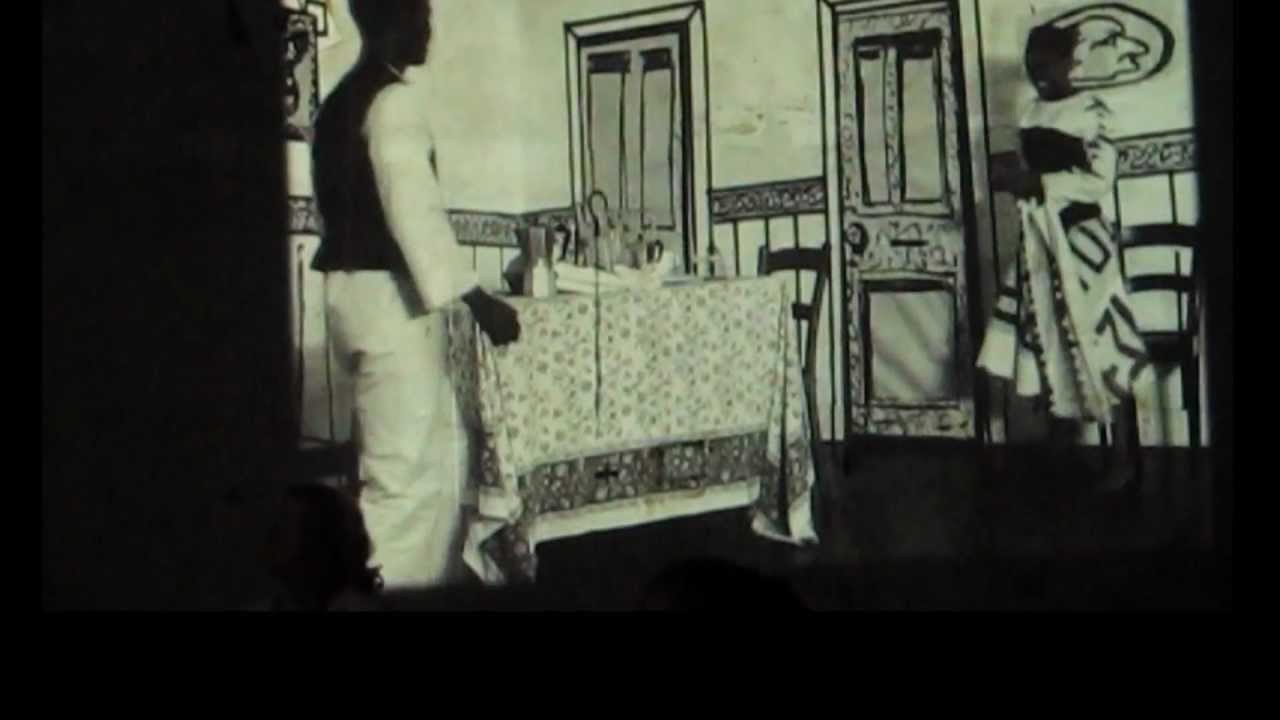
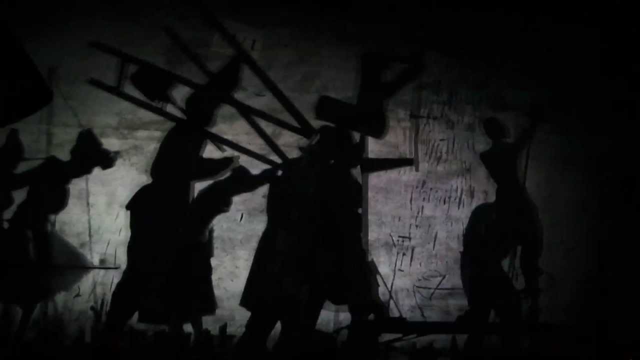
The William Kentridge work The Refusal of Time which I saw at PICA, also has qualities that I wish to capture. The texture of the room itself was a huge influence, with walls that have been papered and ineffectively cleaned up prior to being used for projection, and walls that appeared to be made of either sandpaper or black sand. It also strongly examined movement in various ways. The pictures don't show it quite effectively, but couldn't locate a video (after an admittedly quick search, bearing in mind it has five separate projections in the installation, and a physical kinetic machine present in the room)


Photo's from the William Kentridge show the refusal of time

However I wish to include certain elements, such as sound, colour study and audience interactivity. 

Tuesday, 25 March 2014

Video layering


I was using Sony Vegas to try some video layering, I looked at any tutorials I could find on video layering, ghosting, cloning and overlaying. It was a repetitive process that was very time consuming and frustrating at times. I was playing around with many video effects, adding some taking some away trying to get the desired effect. After trying I couldn't even achieve the exact effect I was after although I did create some kind of feint ghost effect. Above is the edited video, below is the raw version.


So, i've tried my hand at manipulating some images, using Microsoft Word's 'format picture' tools. I've used Word for a few reasons, firstly being that I like the imperfections that come with the lack of control I actually have of the outcome. Secondly because I don't know how to use Photoshop and the familiarity and simplicity of Word is comforting. These images or images like them will be used in collages during the semester.

So as you can see above I've taken a photo of some strangers on the Midland line and then removed the background and applied a black and white setting. It's very special because the original image is so bland and the edited image has so much atmosphere - the profiles are priceless.

Here i have done the same with a Transperth image from the interwebs:


Here are some more I made. Please note they are only the basis of any work to come. For the past year thematically I have been working with a bundle of concepts that circulate around public transport. Such as nodes & networks, tickets, strangers, routines, waiting, urban space and the politics of public space. So generally i take photos of people waiting or commuting on public transport with my iphone and make things from it. I feel like cutting a select part of the images out creates an awareness of space. 


 I also have a few videos of bus window reflections and another few videos of bus handles swaying in time as the bus turns. I need to work out how to make these videos into something. 

Ellen

More on Cosplay - Deadpool and Embracing the Character

More on Cosplay and Cosplay Environments-

As I mentioned in my first post about the ideas of cosplay, one of the best places to find cosplayers are at conventions and fan-based expo's.

And it's where you can also find a huge intermix of literally hundreds of fandoms and characters being cosplayed.

From iconic book characters to infamous comic book characters, the possibilities are endless. Here for example, is one of my favourites; Deadpool being confronted by Gandalf. They'd never meet in their own universes outside of a very whacky cross over, but they both remain in character - Gandalf and his famous line, 'you shall not pass' and Deadpool being the oddball he is, tries to get around him.

Okay. I'm gonna give you guys some more Deadpool examples - he's one of the best characters to cosplay, in my opinion, mostly because he's a great character for satire; he takes the piss out of everything in some seriously funny ways.


Fight with a Power Ranger? More like a sissy slap fight. Deadpool is a good example of how cosplayer's can have fun without breaking character; he's a character that breaks stereotypes of characters. These cosplayers (they might be the same one, I don't know for sure), are all playing up the idea of Deadpool just being an idiot and all round crazy character.
Here's a few more examples of Deadpool cosplayers (I'm going with him since he's so easy to work with).


Admittedly most of the other cosplayer's the Deadpool cosplayer's are interacting with are other Marvel or DC or whichever character, but the cosplayer's are still having fun and getting up to all manner of shenanigans because the cosplayers are embracing the idea's of the character's personality traits - whacky, weak, idiotic; the list goes on.

These gifs have obviously been taken from videos taken whilst at these conventions, so it's not exactly professional photography or cinematography or anything. Most of the shot's are long shots, to show the entirety of what's going on between the characters. The only closer shot is the mid shot of the arm-wrestle, to give a sense of how hard Deadpool is trying to win, and quite obviously losing.

I thought I'd make a Deadpool post since I've been lacking the motivation and time lately to make anymore gifs myself, but I wanted to have something to show at the very least. I also just found a whole handful of my convention photos that I had stored on a couple of my USB's have been damaged and corrupted, so I'm unable to put up some of the really amazing ones as I'd hoped; instead next time I'll make a post using some of the ones I took from my phone, which aren't of such great quality, but I'll also be throwing in a few from friends at other conventions around the world (I've been asking around on my dA, tumblr, etc for help from fellow cosplayers), and should have a good handful to upload soon.

Til next time then.

~S


Monday, 24 March 2014

water layering

This is some ice cude splash in glass of water on white, slow motion, layer
take the vidoe to have a look
http://footage.shutterstock.com/clip-3344552-stock-footage-ice-cube-splash-in-glass-of-water-on-white-slow-motion-fps-fullhd-video.html?src=rel/3347198:3

more my water reseach

A friend challenged her friend to two separate themes…..”motion” and “water”. She tried to capture both in one image. Below are some water shots she took trying to capture motion. It was pretty challenging, but fun non-the-less. Enjoy.
waterdropswaterdrops-2waterdrops-3waterfunwaterfun-2waterfun-3

Something of Interest - Photographer Swallowing 35mm Flim+Interesting Results

an interesting thing that i found. i don't know if it will benefit anyone, but it's here if anyone is looking into film and so on.
~S
Photographer Swallows 35mm Film

Sunday, 23 March 2014

Ellen Norrish

Sorry everyone but i feel like this is going to be a HUGE post as i haven't posted in the last 2 weeks.

So I have been looking at the relationship between analog collage and digital collage. (By analog I mean you're manual cut&paste collaging). I'm very interested in collage and have recently noticed a general wankyness associated with analog. i.e. artists advertise on their website that they are strictly 100% analog. So I've decided to spend the semester looking at both ways of practising collage, exploring the tensions between them and defining the middle ground by combining the two.

So far my research has told me that in the eyes of the many analog collage artists, digital collage is a form of cheating. Much like any kind of analog vs. digital friction (think of vinyl vs. serato dj mixing, film cameras vs digital cameras). These analog artists see digital collage as cheating because the technology does a lot of the hard work for them. As much as i love getting messy with glue, digital collage is much more time efficient - especially if the collage is only the first part of a screen printing process. I'm going to try use them both this semester.

Here are some quick examples of analog collage artists i've been looking at:

Alejandro Chavetta - http://cargocollective.com/chavetta


Mario Wagner - http://www.mario-wagner.com/


Jelle Martens - http://www.jellemartens.be/ and http://www.flickr.com/photos/jellemartens/


Randi Antonsen - http://www.randiantonsen.com/


Virginia Echeverria - http://www.flickr.com/photos/virginiaecheverria/


And here are some examples of Digital collage from a book called Cut Paste Collective http://bnn-international.blogspot.com.au/2012/01/cut-paste-collective-digital-x-analog.html

I found this books pages as a really great example of digital collage as it goes through (sadly in japanese) how the various artists have composed the artwork using Photoshop or Illustration CS with the designated motifs given by the book's editors.


I also found a great video by artist Celio Braga which in my opinion embodies a balance between traditional and new media

http://www.youtube.com/watch?v=pdD7e27LH44

Anyway this is a snippet of my research - will hopefully be able to post some of my own collages next

Saturday, 22 March 2014

One of the girls in class was also discussing projections and projecting onto a shape or unusual surface....

This is a kinda cool video/ concept that I just stumbled across.

http://www.ignant.de/2013/10/07/projection-mapping/

Wednesday, 19 March 2014


Visual Research Project; Creating a montage of images through a GIF to make connections between images that would otherwise have separate meanings.

I have a rough idea of what i want to create, something along the lines of a long GIF that shows the human emotions, characteristics, associations with particular human actions. The best way to express this concept would be through using the concept of an athlete (through photography and illustration) preforming and through the imagery to display the different stages and elements present both in the athlete''s mind as a performer but also the animal instincts that are expressed through the actions.


Ideation: Just some rough sketches of what i want to create for my project.
http://vimeo.com/18093439

just found this example of video layering, I'm going to try this on the fretboard.

Ronnie Shalvis/Assassin's Creed Cosplay - animation test

Ronnie Shalvis as Altair I'bn-la Ahad from Assassin's Creed. 


Looking a little bit into the similar ideas of animation we worked on with the Muybridge Human Body in Motion, I wanted to expand a little on creating movement while also focussing on ideas of composition behind cosplay, which is more or less an art in itself. Cosplay has been a growing trend lately - think of your favourite TV show or cartoon or anime or video game, then attend any sort of fantasy, sci-fi, anime expo or convention like the ever popular Wia-Con (an anime convention held here in Perth usually at the beginning of each year), and you'll see hundreds of people dressed up as Naruto (Naruto), Pikachu (Pokemon), Flynn (Adventure Time), Altair or Ezio from the Assassin's Creed video game series, among dozens upon dozens of others.

Really, cosplay is the amature version of costume creation and design; hundreds of hours go into planning, gathering and manipulating of materials (be it fabric, PV foam, timber, etc), and then the showcasing of these cosplays in photoshoots, at conventions, and, as is the case with the gif above, in fan-made films posted most commonly on youtube.

So here we've got an incoporation of film, cosplay and even a sport (one that is a prominent feature in the material the cosplay is based on) - Ronnie Shalvis, a parkour and free running athlete, was contacted by the creator of this film, Devin, who wanted to make a simple fan-made film, and they came up with an entire amv (if you're curious the youtube link is here -> http://www.youtube.com/watch?v=aAhPaiajwDY )

Anyway. In this small animation I've basically gone frame-by-frame through one specific sequence of the video, in which, as you can see, Ronnie performs a backflip off a high wall onto the ground, before doing a backwards parkour roll out of it to cushion his landing; we can see how he embraces the role of the character of Altair not simply in costume but also more or less in character/personality - one of the features of the Assassin's Creed game is performing what is called a Leap of Faith - taking a dive and flip from a high tower/place after scouting out a certain area of the game map to return to ground level. Admittedly the backflip is a different sort of stunt performed in game, but nonetheless shows an embodiment of the character's fearlessness.

Getting away from all the techincal analytical stuff, what I'm trying to show is my idea of how people, just every day people, can 'compose' cosplays and their ideas about the characters they want to show off. Most won't do cool stunts like Ronnie - most showcase other aspects of the character if they are supposedly "in character" or "role playing" as the character (whichever character that may be - I'm merely using the character of Altair being cosplayed by Ronnie as an example).

I'm interested in the idea of cosplay as an art, how it's not just acknowledged 'artists' or 'costume designers' that can pull off really amazing and cool cosplays. If I had more photos from some of the conventions I've been to in the last two years, I'd post them, since there are some seriously awesome ones to look at (for example, a Final Fantasy cosplayer with a 14 ft wingspan). Maybe in the next post.

~S

Tuesday, 18 March 2014

Valleri Foster- composition research

For this media class, I wanted to focus on using projections. When considering composition, so far, I have been thinking about how I want to present the projection rather than what will be projected.


In the initial stages of researching projection artworks/artists, I had come across a video of Ryoji Ikeda’s “The Transfinite” (http://www.youtube.com/watch?v=omDK2Cm2mwo) and I was interested in how he chose to project not only on the wall but also on the floor. I liked how Ikeda used large projections compared to the sizes more commonly seen in classrooms. I quite like how the height of the video makes the people watching it look as if they are apart of it instead of an audience and his work in general made me more conscious about the lack of limitations that come with using a projector.

I then watched Y-3’s Spring 2013 runway show in New York Fashion Week (http://thecreatorsproject.vice.com/blog/y-3s-new-york-fashion-week-runway-projections-were-a-colorful-triangulated-masterpiece). In the show, they had projected images onto pyramid shapes that pushed the projections to another level and dimension. This led me to look at others who had projected onto non-flat surfaces, such as Katja Loher. The video sculpture artist does something similar in her piece “Video Planets” (http://katjaloher.com/videoplanets.htm), where she has projected videos onto floating chloroprene balloons. Also, her work “Bubbles” (http://katjaloher.com/bubbles.htm) pointed out the opposite to that of Ikeda’s, as she made me consider the potential smallness of a projection (although Bubbles does not use projections). However, Loher’s projections still managed to compliment the spherical shape of the balloons.

I then came across Dev Harlan and Olek’s “Suffolk Deluxe Electric Bike(http://vimeo.com/19817933). Because the bike was a single colour and its shape simplified, the projection was able to alter the look of the bike. The crochet pattern projections combined with the plain silhouette of the bike made the lines and shapes melt and created the slight illusion of a new form.

“Lit Tree” by art duo Kimchi and Chips (http://thecreatorsproject.vice.com/blog/communicate-with-a-potted-plant-using-projected-light) projected onto trees to produce a light pattern that has a sci-fi-outer space look. I was particularly interested in this piece because of the way the artists had used the trees to make the projections more abstract. I found this video to be the most interesting because of the distorting nature that occurred to the projection from the leaves.

However most, if not all, the artworks above had projections that were intended and planned to be somewhat “synced” or complimentary to the “canvas”. One idea I would like to create is more similar to that of Lit Tree and Suffolk Deluxe Electric Bike where the use of a textured and/or an unconventional canvas would distort a projection while still being interactive to an audience like Ikeda’s mentioned work. I thought about projecting onto balloons of different shapes and colours, asking for audience participation as they throw darts to pop the balloons and reveal the true image. The image/video would (hopefully) be distorted enough that people could not tell what it was unless the balloons were popped.


Another idea I had would be to project into a dollhouse. Like Loher’s Bubbles, I thought it would be interesting to use the insides of a dollhouse as a canvas due to its smaller size. Based off a song by Melanie Martinez titled Dollhouse, I also like the concept of dollhouses being the example of a perfect life. So there could be the projections of different people in different rooms and situations around the dollhouse to either emphasize the “perfect” life or contradict it.

water in motion

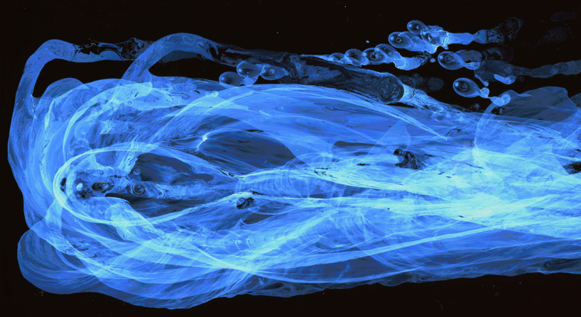
frozen images of translucent liquid in motion compose israeli artist moses hacmon‘s series, ‘faces of water’. the pictures expose previously unphotographed movement — the flow of water — capturing a singular moment in a clear, three dimensional space. the project was driven by his ambition to visually represent time through concrete objects, and his curiosity in the physical characteristics of the compound, particularly its movement through a vessel, reaction to light, and endless transformations. hacmon spent eleven years studying and investigating these properties, seeking out in which ways he could photographically capture the transparent liquid.http://vimeo.com/70831102
faces-of-water-moses-hacmon-designboom-01